Brand and Identity Design | Logo Design | Illustration Design
The Alarmist is a fresh, dark and humorous printed literature anthology aimed to be published biannually. It will host a variety of contemporary/experimental thoughts, ideas, illustrations and critical writings.
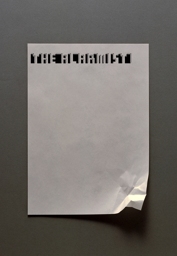
I recently finished designing the logo, part of the alarmist identity and currently working on the layout for the the first issue which will be available in bookstores this June.
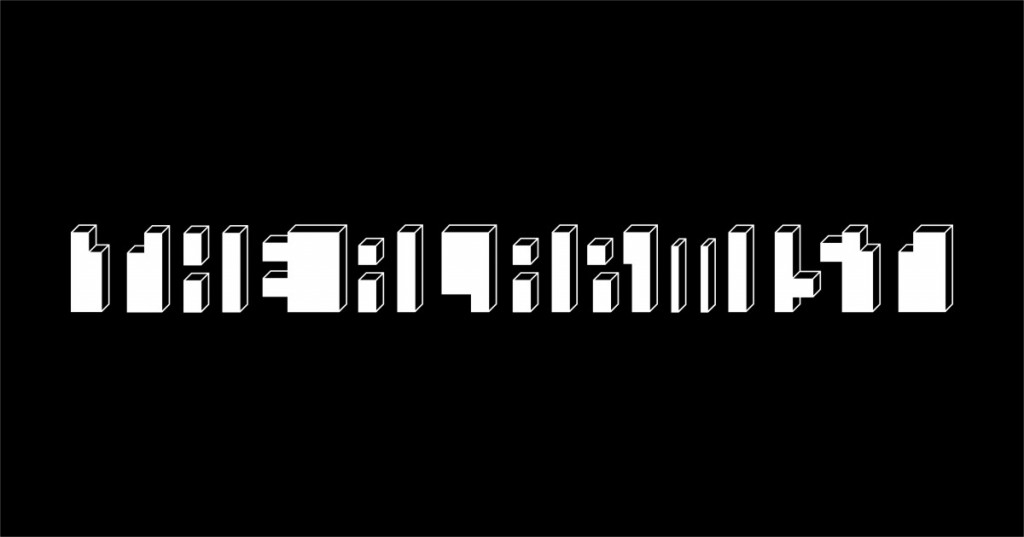
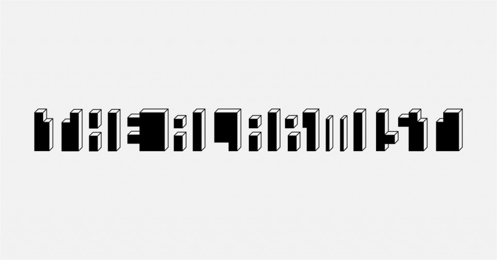
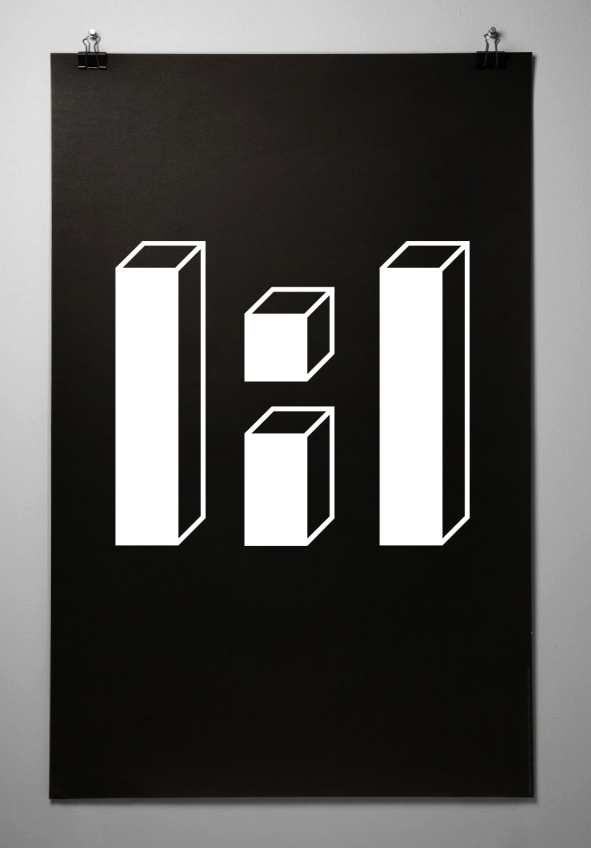
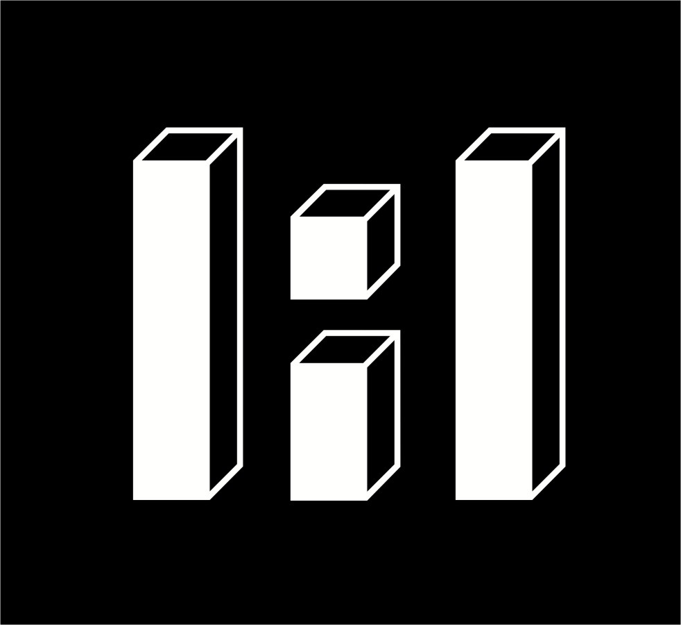
The Logo design is based on optical illusion principles in an attempt to generate an equivocal reading, as the title of the magazine suggests.
Distance yourself from the monitor screen to experience the illusion, train your gaze to be able to jump between abstract cubes and written messages.
Client : The Alarmist magazine
Design Task : To create a coherent visual identity for the Alarmist magazine through a humorous and experimental approach. Deliver a Logo for printed and web applications and design cover and inner layout for the first issue.
Editor: Gary Hartley | Mansoun Chow
www.alarmistmagazine.co.uk
[email protected]

